Charlemagne Trust Brand Guide
Official colour palette and logo assets for all Charlemagne Trust materials.
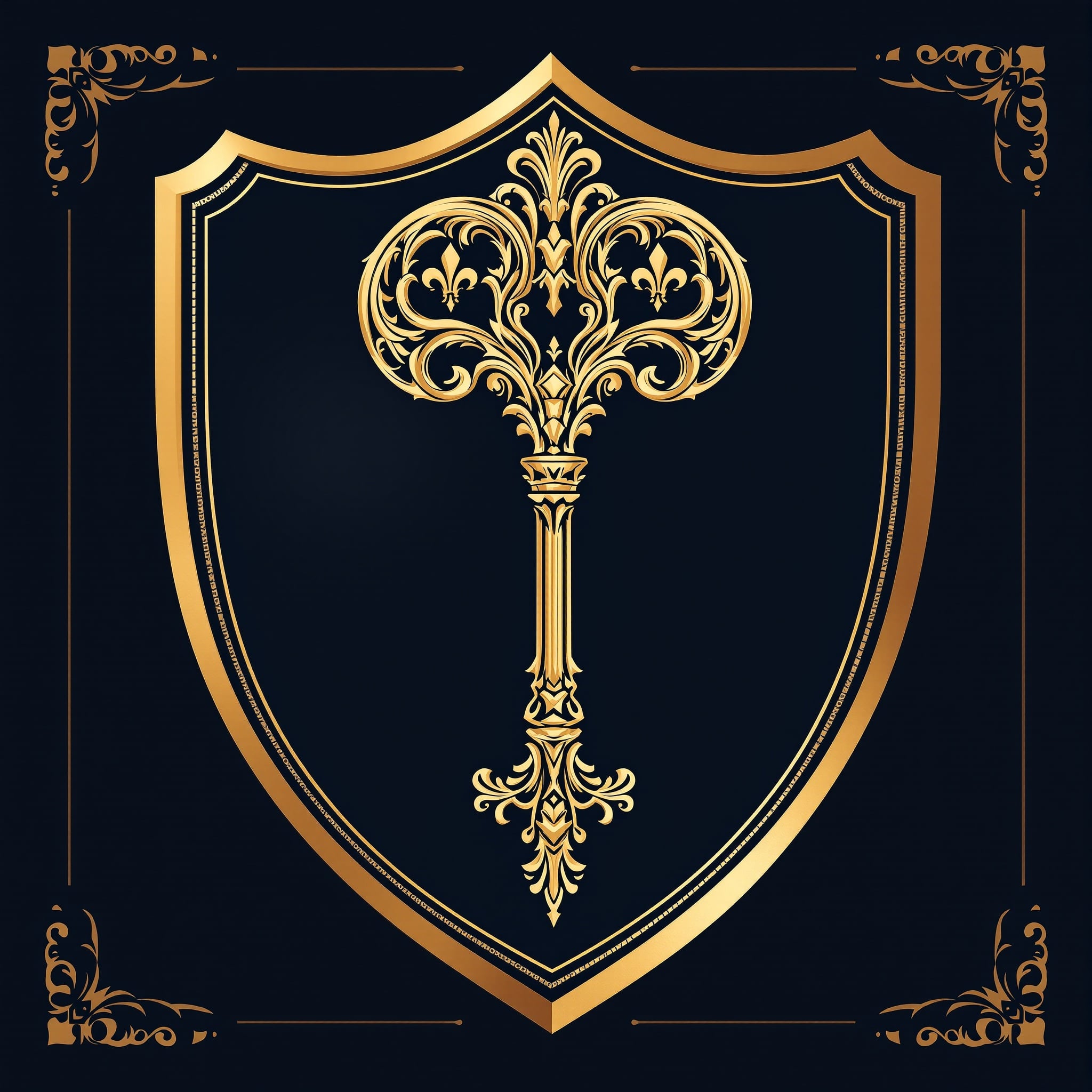
Logo
The Charlemagne Trust emblem features a gold heraldic shield with an ornate antique key — symbolising the unlocking and protection of heritage.
On Dark Background
On Light Background
Large (64px)
Medium (48px)
Small (32px)
Logo CDN URL: https://cdn.abacus.ai/images/4081e12e-42c7-4c81-aeef-61e88ee080de.jpg
Typography
Two typefaces form the Charlemagne Trust’s visual identity.
Headings
Playfair Display
The quick brown fox jumps over the lazy dog
Weights: 400, 700 · Use for: headings, quotes, feature text
Body
Inter
The quick brown fox jumps over the lazy dog
Weights: 400, 500, 600, 700 · Use for: body, UI, navigation
Colour Palette
The official Charlemagne Trust colours. Click any swatch to copy the hex code.
Primary — Gold
Gold
#C9A84CRGB: 201, 168, 76
Primary brand color. CTAs, accents, headings, icons, key UI elements.
Gold Light
#E8D48BRGB: 232, 212, 139
Hover states, highlights, gradient start, secondary gold elements.
Gold Dark
#A08030RGB: 160, 128, 48
Gradient end, dark gold accents, borders, text on light backgrounds.
Foundation — Navy
Navy
#0F0F1ERGB: 15, 15, 30
Primary background, headers, footers, card backgrounds.
Navy Light
#1A1A2ERGB: 26, 26, 46
Secondary backgrounds, elevated surfaces, cards on dark backgrounds.
Navy Mid
#2A2A4ERGB: 42, 42, 78
Borders, dividers on dark backgrounds, hover states.
Neutrals
White
#FFFFFFRGB: 255, 255, 255
Text on dark backgrounds, light section backgrounds.
Off White
#F9FAFBRGB: 249, 250, 251
Alternate section backgrounds (gray-50), form backgrounds.
Light Grey
#E5E7EBRGB: 229, 231, 235
Borders, dividers, input borders on light backgrounds.
Mid Grey
#6B7280RGB: 107, 114, 128
Secondary text, captions, muted content.
Dark Grey
#374151RGB: 55, 65, 81
Body text on light backgrounds.
Accents & Supporting
Success Green
#16A34ARGB: 22, 163, 74
Success states, confirmations, positive indicators.
Error Red
#DC2626RGB: 220, 38, 38
Error states, validation messages, destructive actions.
Warm Stone
#D4C5A0RGB: 212, 197, 160
Heritage accent, limestone references, subtle warm tone.
Deep Burgundy
#6B1A1ARGB: 107, 26, 26
Tertiary accent for premium/luxury feel, wine references.
Gold Gradient
Used for primary CTAs, buttons, and feature elements.
background: linear-gradient(135deg, #E8D48B 0%, #C9A84C 50%, #A08030 100%)Usage Examples
How the palette works together across different contexts.
Dark Context
Gold on navy creates the core premium feel of the brand.
Light Context
Navy text on white with gold accents for readability.